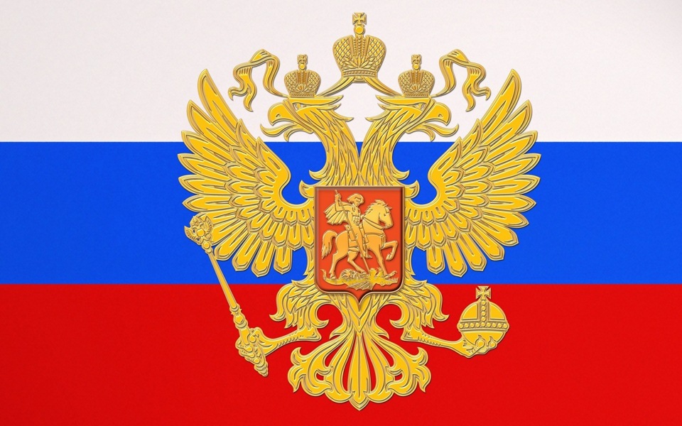
Blue yellow black flag. Imperial flag, where it came from, what it means
Before Tsar Alexei Mikhailovich, Russia did not have a single state banner. Russian people in different circumstances used different symbols to express their folk, Russian essence - banners, icons, Cossack horsetails, banners of Streltsy regiments, etc. Apparently there was no pressing need for such a symbol; its functions were performed by the coat of arms of the Russian state - a double-headed eagle. The Russian state flag also grew from similar symbols, and it took shape under Tsar Alexei Mikhailovich (father of Peter the Great).
In 1668, Tsar Alexei Mikhailovich ordered the creation of an armorial ("herital") banner, which contained almost all the official and unofficial symbols of the Orthodox Russian kingdom.
It was trapezoidal, with a wide crimson border with the image of Christ in the upper part among two eight-pointed Russian crosses with a foot. On a large white “kerchief” (1.69 m wide, 4.36 m long at the top) a golden double-headed eagle with two crowns, a scepter and an orb was placed, on the eagle’s chest shield there was a “king piercing a serpent with a spear.” Under the eagle was a view of the Kremlin with the inscription “Moscow”, and all around were the regional coats of arms of the kingdom. All this, as well as the full title of the king along the border, revealed the political program of the government - the unification of all lands Ancient Rus' under the rule of Orthodox Moscow.
The banner took part during state and church ceremonies and served as a royal standard - it was worn in front of the king on campaigns.
 In 1667-1669, in the village of Dedinovo near Moscow, on the Oka River, by order of Tsar Alexei Mikhailovich, a small military flotilla was built to protect merchant ships on the Volga and the Caspian Sea. The main one among the ships being built was the three-masted ship "Eagle". The warship needed an identification sign - a flag. The captain of the "Eagle" D. Butler turned to the government with the question of which flag to fly on the ship. The question turned out to be very relevant, and Alexei Mikhailovich had to decide what the state colors of Russia would be. The colors white, red and blue were presented to him for approval. The developers proceeded from the fact that, according to Russian everyday concepts, the color red meant courage, heroism, and fire; blue - sky, spirituality, faith; white - peace, purity, truth, nobility.
A document from 1668 has been preserved, which states that silk fabric in white, blue and red was issued for a large banner “that lives in the stern.”
In the book “Ship Flags” by Karl Allard, published in Amsterdam back in 1695, this flag is described as follows: “the Moscow flag, defined by a blue cross, the first and fourth quarters are white, the second and third are red.” The first Russian naval flag was originally striped (it was also called a half-length flag), similar to the modern Russian State Flag.
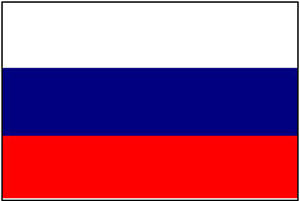 In 1696 - 1701, Peter the Great created many sketches and designs of flags and pennants. He did not change the state colors, but determined the exact location of the horizontal stripes, coinciding with the ancient understanding of the structure of the world: below - physical, carnal (red); above - heavenly (blue); even higher - divine (white). January 20, 1705 can be considered the birthday of the future national flag: a decree was issued on behalf of the tsar, according to which the white-blue-red flag (“besik” or “besikr”) became the flag of merchant ships. It will be called provisions, trade, merchant, commercial, “philistine”, civil and, finally, Russian national. The white, blue and red Russian national flag was also a symbol of Slavic solidarity, the struggle of the Slavs against enslavement by Austria-Hungary and Turkey in the 19th century. The state flags of Slovakia, Slovenia, and Serbia originate from the Russian white-blue-red banner.
Demonstration of the white-blue-red flag in international waters 1696 - 1700. suggests that it was considered state.
Almost at the same time, on turn of the XVII and XVIII centuries, Peter I gave the Russian to the navy the new flag is "Andreevsky". White color The fields and blue cross of the St. Andrew's flag were not chosen by Peter I by chance. For the military flag of the fleet, the tsar took the colors of the top two, most honorable stripes of the white-blue-red flag.
After the death of Peter the Great, the question of a state banner was not raised, although in one of Anna Ioannovna’s decrees black and gold (yellow) colors were called state colors. The coronation banner of Elizabeth Petrovna was “built” in these same colors.
Each of the Russian monarchs made their own amendments to state symbols. During the reign of each of them, noticeable changes took place in Russian society, the country's borders expanded, social transformations were carried out, and the status of the Russian state changed.
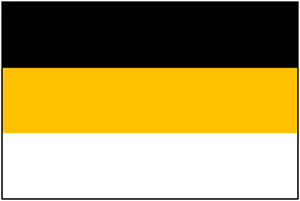
Since the beginning of the 19th century, flags have become one of the most expressive symbols of all leading states. A tradition has emerged of decorating streets and buildings with state flags during major celebrations. Obviously, thanks to the merchant fleet, the Russian white-blue-red flag was well known abroad. When the Russian army entered Paris in March 1814, Parisians hung white, blue and red banners, considering them Russian. In 1856, while celebrating the conclusion of the Treaty of Paris after the end of Crimean War, the houses were decorated with the flags of the warring powers. Russian white-blue-red flags were called the flags of "Russian national colors". For the first time, the Russian “national” flag was officially approved in 1858. By this time, the musical symbol of the Russian Empire had already been created - the anthem “God Save the Tsar!” (1833). In 1857, the drawings of the state emblem were also officially approved. On June 11, 1858, Emperor Alexander II approved the design of “heraldry flowers on banners, flags and other items used for decoration on special occasions.” The law established that “the arrangement of these colors is horizontal, the upper stripe is black, the middle one is yellow (or gold), and the bottom one is silver (or white).” To justify the colors of the flag, they were associated with the historical colors of the state emblem: a black eagle in a yellow (golden) field and a white horseman in the Moscow coat of arms. In the text of the law, this explanation sounded as follows: “The first stripes correspond to the black state eagle in a yellow or gold field and the cockade of these two colors was founded by Emperor Paul I, while banners and other decorations of these colors were already used during the reign of Empress Anna Ioannovna. The lower stripe is white or silver corresponding to the cockade of Peter the Great and Empress Catherine II; Emperor Alexander I, after the capture of Paris in 1814, combined the correct armorial cockade with the ancient one of Peter the Great, which corresponds to the white or silver horseman (St. George) in the Moscow coat of arms.”
 Despite the complexity and ambiguity of such an explanation, the description of the coat of arms claimed the Russian - "national" - tricolor black-yellow-white flag. This flag entered the system of European flags of the 19th century. Gold, black and white colors were used in the design of banners and uniforms Russian army. And yet, both in Russia and abroad, two samples were hung as the state flag: white-blue-red and black-yellow-white.
Coexistence of the two flags until the 70s. The 19th century was not so noticeable, but the question of the “duality” of the most important state Russian symbol is gradually beginning to arise. This duality is also perceived differently by the Russian public.
Vladimir Ivanovich Dal, honorary academician of the St. Petersburg Academy of Sciences, author of the famous “ Explanatory dictionary living Great Russian language,” for example, asked: “All the peoples of Europe know their colors, suits, paints - we don’t know them and confuse them, raising multi-colored flags at random. We don't have a national color. What colors should we pick up and wear, what colors should we decorate buildings with, etc. during peaceful public celebrations?”
Ardent defenders of the “Russian autocracy” believed that there could be no talk in the state of any flag other than one legalized by the emperor: the people and the government must be united. They were also frightened by the red banners, which, as a symbol of anti-government political movements In those days they began to appear on the streets of the capital.
“Independently” white, blue and red banners went out onto the city streets: they surrounded the monument to Pushkin in Moscow on June 6, 1889, a monument to the grenadiers who fell near Plevna. Projects of the national flag appeared on the pages of the press.
Under these conditions, the emperor Alexander III hastened to declare his desire “to see national flags in the Russian capital....” And on April 28, 1883, a legislative decree of Alexander III “On flags for decorating buildings on special occasions” appeared. It said that “on those solemn occasions when it is considered possible to decorate buildings with flags, only the Russian flag was used, consisting of three stripes: the upper one is white, the middle one is blue and the lower one is red.” However, the imperial colors were not completely abandoned, because there was no Imperial command to abolish the black-yellow-white flag. Flags of black-yellow-white and white-blue-red were hung on the streets as symbols of the Russian state.
The current situation marked the beginning of a discussion about Russian state national colors. This discussion was associated not only with increased interest in history, but primarily with the need to understand modern processes and the future of Russia.
Before the coronation of Nicholas II in March 1896, on his instructions, “a special meeting was convened to consider the issue of the Russian national flag, which came to the unanimous opinion that the white-blue-red flag has every right to be called Russian, or national, and the colors his: white, blue and red - are called state ones. The white-blue-red flag was installed uniformly for the entire Russian Empire.
What prompted the tsar to quickly resolve a difficult issue for Russia on the eve of his coronation?
First of all, Nicholas II was, of course, an educated person, he understood many issues, including the history of the state. And in the situation late XIX V. To unite all categories of the population, a truly Russian symbol was required. This was the white-blue-red flag introduced by the great sovereign who glorified Russia. The symbol that unites the people and the tsar, the white-blue-red flag of Peter the Great, was intended by the government to be an alternative to the ever-increasing use of the red flag.
Sources: State flag Russian Federation// Coat of arms, flag and anthem of Russia. Studying the state symbols of the Russian Federation at school / comp. M.K. Antoshin. - M., 2003. - P. 39-44.
From the pedigree of state symbols. Coat of arms. Flag // Home Lyceum. - 2001. - No. 1. - pp. 39-44.
Imperial and “philistine” // Coat of arms and flag of Russia. X - XX centuries / ed. G.V. Vilinbakhov. - M., 1997. - P. 435-451.
Pchelov, E.V. Banners of pre-Petrine Rus' / E.V. Pchelov // State symbols of Russia - coat of arms, flag, anthem. – M., 2002. – P. 89-93.
Soboleva, N.A. Banners of the 18th century / N.A. Soboleva // Russian state symbols: history and modernity. – M., 2002. – P. 153-156.
Flags of Peter the Great // Coat of arms and flag of Russia. X - XX centuries / ed. G.V. Vilinbakhov. - M., 1997. - P. 419-434.
Literature: Golovanova, M.P. Russian flags fly / M.P. Golovanova // Coat of arms, flag, anthem of Russia. - M., 2004. – P. 32 – 33.
Golovanova, M.P., Shergin, V.S. State flag of Russia / M.P. Golovanova, V.S. Shergin // State symbols of Russia. – M., 2005. – P. 98 – 126.
Degtyarev, A.Ya. History of the Russian flag. Legends, facts, disputes / A.Ya. Degtyarev. - M.: Military Parade, 2000. – 136 p.
Silaev, A.G. Origins of Russian heraldry / A.G. Silaev.- M.: Fair-Press, 2002.- 240 p.
If you remember, it consists of a top black stripe, a middle yellow stripe, and a bottom white stripe. It was in this form that it was adopted in 1858. But this has always seemed illogical to me - I’ll explain why a little later. No, not the colors themselves, but their arrangement. However, first things first...
There is a lot of debate about the correct placement of the colors on the flag. Russian Empire. Which is correct: black-yellow-white or white-yellow-black? Unfortunately, there is a sea of publications on this topic, mostly of an educational nature, where there is no justified explanation of how colors should be positioned correctly. There is only a reference to the highest approved decree No. 33289 of June 11, 1858 “On the arrangement of the coat of arms of the Empire on banners, flags and other objects used for decoration on special occasions.” But the circumstances under which the decree was adopted, the current state situation and who was the author of this document are not indicated.
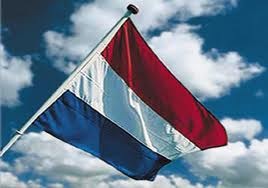
So until 1858 the flag was different. The order of the colors in it was as follows: starting with the top stripe - white, then yellow and black at the bottom. It existed in this form until its official adoption. Along with it, there was a white-blue-red one... But the white-yellow-black flag before Alexander II, and after that the black-yellow-white flag was perceived by society as an imperial, government flag, in contrast to the white-blue-red flag of the Russian merchant fleet. The imperial flag was associated in the minds of the people with ideas about the greatness and power of the state. This is understandable, what could be majestic in the trade flag, in its very colors, which were artificially tied to Russian culture by Peter I? Of course, one cannot deny all the merits of the Great Emperor, but here he clearly went too far (he simply copied the colors of the Dutch flag).
Coexistence of two flags until the 70s. XIX century was not so noticeable, but the question of the “duality” of the most important state Russian symbol is gradually beginning to arise. This duality is perceived differently by the Russian public. Ardent defenders of the Russian autocracy believed that there could be no talk of any flag other than the imperial one, legalized by the emperor: the people and the government must be united. The opposition to the tsarist regime stood under the trade flags of white, blue and red, which became a symbol of the anti-government political movements of those years. It was these colors that were defended by the so-called. “liberal” circles who shouted to the whole world that they were fighting the despotism and reactionary nature of the tsarist government, but, in fact, they were fighting against the greatness and prosperity of their own country.
During this heated controversy, Alexander II died at the hands of the revolutionaries. His son and successor, Alexander III, on April 28, 1883, gave the white-blue-red flag the status of a state flag, but did NOT CANCEL the imperial one. Russia now has two official state flags, which further complicates the situation. And already on April 29, 1896, Emperor Nicholas II ordered that white-blue-red be considered the National and State flag, also indicating that “other flags should not be allowed.”
Black-yellow-white remained only with the imperial family. The emperor was “persuaded” because supposedly all Slavic peoples were assigned these colors - and this emphasizes their “unity”. And explaining this by the fact that the black-yellow-white flag “does not have heraldic historical foundations in Russia” to be considered a cloth bearing Russian national colors. This begs the question, what kind of historical basis does the trade flag have?
But let's return to the white-yellow-black banner. That is, then, before adoption, the white-yellow-black flag was simply turned over.
The “coup” can also be traced to its author – Bernhard Karl Köhne (he will be discussed at the end of the article in order to fully understand what kind of person got involved in “correcting” Russian heraldry). Upon his accession to the throne, Alexander II decided, among other things, to put the state symbols in order - and to bring them into line with pan-European heraldic standards.
This was to be done by Baron Bernhard Karl Köhne, who was appointed head of the stamp department in 1857. He (Köhne) was born into the family of a secret state archivist, a Berlin Jew, a heretic who converted to the Reformed religion. He came to Russia under the patronage. In heraldic historiography he earned a sharp negative assessment, despite his vigorous activity.
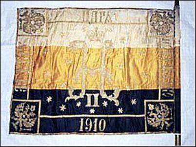
But be that as it may, the flag was accepted and in this form it existed until 1910, when monarchists raised the question of the “correctness” of the flag, since the 300th anniversary of the House of Romanov was approaching.
A special meeting was formed to clarify the issue “about the state Russian national colors.” It worked for 5 years, and the majority of participants voted for the return of the imperial white-yellow-black flag with the “correct” arrangement of colors as the main, state flag.

For some reason and why - it is not clear, but they made a compromise - the result was a symbiosis of two competing flags: an eclectic white-blue-red flag had a yellow square with a black double-headed eagle in the upper corner. We fought a little with this in that world war. Further, the history of the imperial flag ends for a well-known reason.
In heraldry, an inverted flag means mourning, Köhne knew this very well, heading the heraldic department of the Empire. The death of the Russian emperors confirmed this. In maritime practice, an inverted flag means that the ship is in distress.
It is clear that colors are still confused and flags are hung upside down, consciously and unconsciously, but for this to happen at the state level and with many years of struggle, we need special efforts special people.
The existence of the white-yellow-black flag is confirmed by newsreels, but they are treated differently due to the black and white film. Supporters of the black-yellow-white flag explain that on the set of the white-blue-red flag, without being embarrassed by the simple experience of comparing colors, when converting colored flags into black and white mode using any well-known graphic editor. Given this experience, the similarity of the white-yellow-black flag to newsreel footage is greater than the white-blue-red one.
Also, the tricolor in the white-yellow-black arrangement can be seen in artists’ paintings.
V. M. Vasnetsov “News of the capture of Kars” 1878
In Vasnetsov’s painting dedicated to the Russian-Turkish war, a white-yellow-black flag is installed. Interesting fact: the painting dates back to 1878, that is, it was written 20 years after the release of statement No. 33289 “on the arrangement of coat of arms flowers,” in which they were changed the other way around. It turns out that the people still used uninverted white-yellow-black flags.
[In the center, there is an assumption that this is the flag (blue-yellow-red) of the United Principality of Wallachia and Moldavia, an ally of the Russian Empire in the Russian-Turkish War (1877–1878). There is also an opinion that this is a Pan-Slavic (common Slavic) flag (if the flag wears blue-white-red colors. It is difficult to judge the color from the reproduction middle zone). Slavic peoples in 1848, at the Pan-Slavic Congress in Prague, a common Pan-Slavic flag was adopted, repeating the colors of the Russian (white-blue-red) flag.]
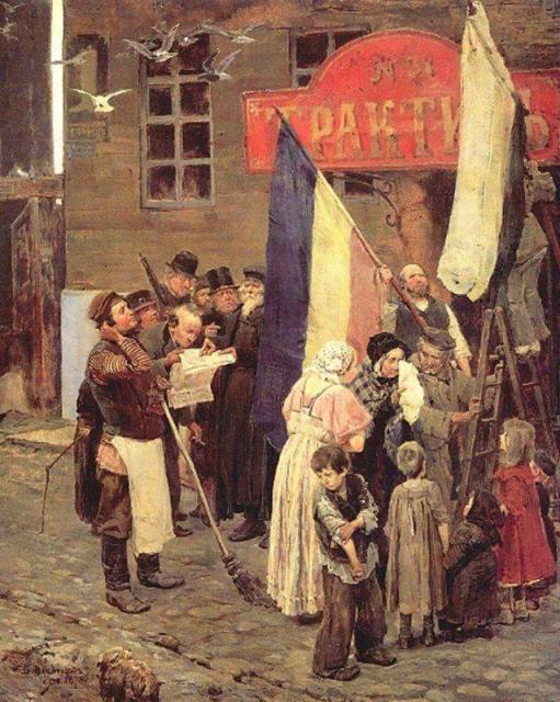
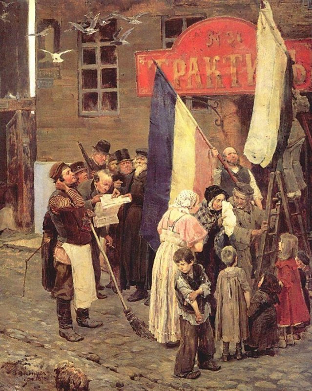
And here is Rozanov’s painting “Fair on Arbat Square”. White, yellow and black flags can be seen waving on the roofs of buildings. And along with them are white, blue and red. The picture was painted just during the coexistence of the two flags.

Painting by A.P. Rozanov “Fair on Arbat Square” 1877
No matter how they explain the location of the black stripe at the top: this is the incomprehensibility of God (what if God is light?), and the greatness of the Empire, and the color of Spirituality (referring to the monastic robe).
Also interpreted as: black – monasticism, yellow – gold of icons, white – purity of the soul. But all this is from the category folk interpretations. Who will come up with something?
It is difficult to guess for yourself the meaning of the colors in this arrangement (black-yellow-white). A logical explanation just doesn't come to mind. But for us, someone “kind” does it himself and slips in his own interpretation, so that no one has even a shadow of doubt about the “correctness” of the arrangement of colors. And if anyone thinks otherwise, they rebuke him: how dare he doubt? The principle “everyone thinks so” or “this is how it is accepted” is in full effect here. They are not looking for the truth, but public opinion, which, alas, almost never has anything to do with the truth.
But the most important thing is missed main point, that the colors of the imperial flag should be identical to the words that express our entire Slavic essence: Orthodoxy, Autocracy, Nationality. Or, to put it another way: Church, Tsar, Kingdom. What color goes with each of these words? I think the answer is obvious.
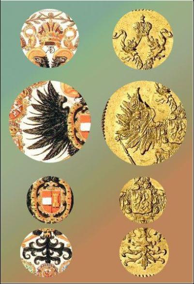
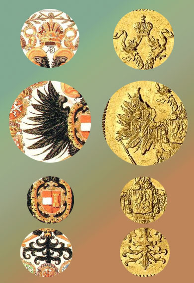
Also, along with the flag, the state emblem also underwent changes in 1858. Koehne created it the way we are used to seeing it. Although under Nicholas I it was different.
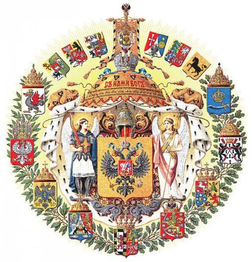
Coat of arms of Köhne, 1858
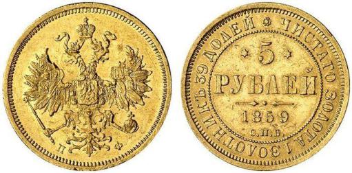
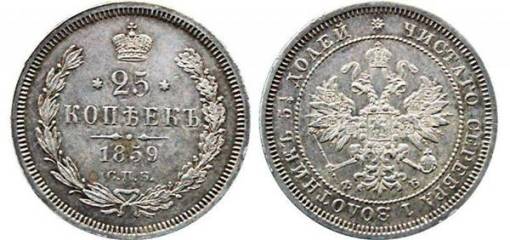
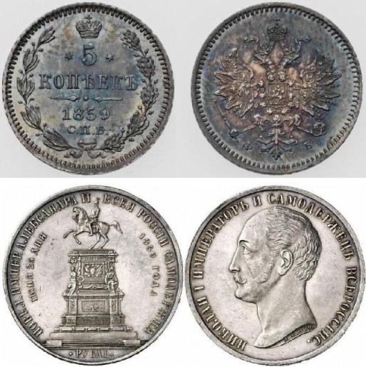
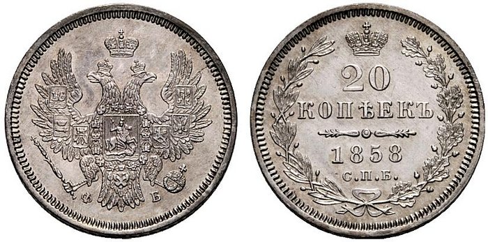
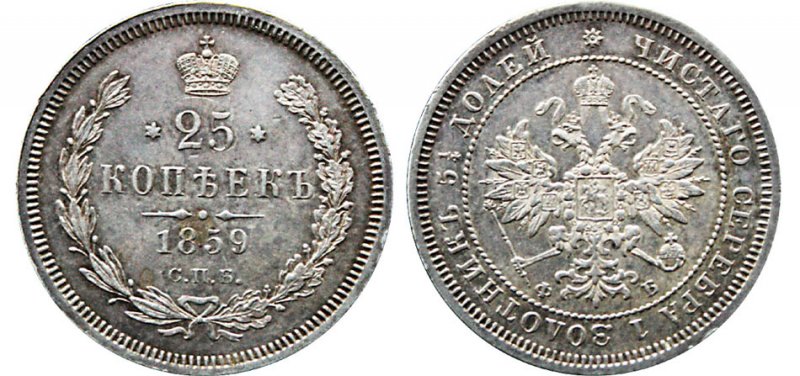
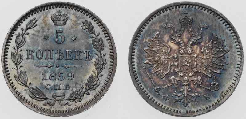
For example, the Coat of Arms depicted on coins. Here are the Nikolaev coins, 1858.
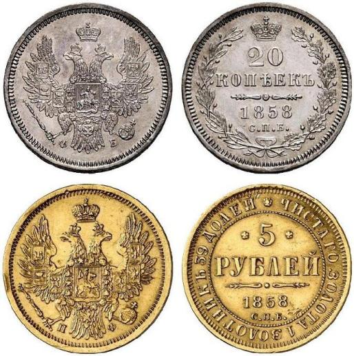
But here is a coin from 1859 of Alexander II (the reign of Alexander II, whose years were called the “era of great reforms”, for Russian Jews, as for the country as a whole, was a sharp contrast to the previous one. Reforms in the economy, relative political freedoms, rapid development of industry - all this, like a century earlier in Prussia, created the conditions for Jewish assimilation, which never happened). Here you can clearly see how accurately the eagle was “licked” from the Habsburg coat of arms. A particularly striking detail is the eagle’s tail. And all this in one year with the change of the flag. Magendovids (six-pointed stars) also appeared on coins. Since the Masons are great symbolists, they just wanted to add at least a drop of tar to our heraldry.
A few more coins for comparison:
Back in 1959, a commemorative coin and medal “Monument of Emperor Nicholas I on Horseback” was issued. Magendavids are now so small that they can only be seen under a magnifying glass.
The copper coins were updated, the design changed radically, the stars there are “Soviet” - pentacles.
The image below shows the similarity of the coat of arms that Koehne “composed” with the coat of arms of the Habsburgs.

Habsburg coat of arms
For comparison:
1. The crown acquired a ribbon (although, in my opinion, it looks more like a snake); before this, this ribbon had never been used in Russian heraldry.
2. The wings have fallen off, previously all the eagles had fluffy wings, but now they are absolutely copied from the Habsburgs, even in design, between the large feathers and there are small feathers here and there. The only thing is that our eagle has 6 feathers, versus 7.
3. The combination of a coat of arms and a chain, although this arrangement was used previously, on all previous coins the Order of the Holy Apostle Andrew the First-Called was clearly visible, now it is just a chain, like the Habsburgs themselves.
4. Main Tail. This is clear without comment.

Bernhard Karl (in Russia Boris Vasilyevich) Köhne (4/16.7.1817, Berlin - 5.2.1886, Würzburg, Bavaria) was born into the family of a secret state archivist, a Berlin Jew who converted to the Reformed religion (Köhne himself and his son remained Protestants, despite the fact that they connected their lives with Russia, and the grandson was already Orthodox).
He became interested in numismatics early on and published his first work in this field (“Coinage of the City of Berlin”) at the age of 20, while still a student at a Berlin gymnasium.
He also became one of the active figures, and then the secretary of the Berlin Numismatic Society, and in 1841–1846. supervised the publication of a journal on numismatics, sphragistics and heraldry.
Köhne met Russia in absentia back in the early 1840s. The famous numismatist Yakov Yakovlevich Reichel, who served in the Expedition for the procurement of state papers, the owner of one of the largest numismatic collections, drew attention to young man, who soon became his assistant in collecting and “representative” in German numismatic circles. After completing his university course, Koehne came to St. Petersburg for the first time.
He returned to Berlin with a firm desire to enter the Russian service and applied for the then vacant chair of archeology at the St. Petersburg Academy of Sciences (which never happened). As a result of Reichel’s patronage, on March 27, 1845, Koehne was appointed assistant to the head of the First Department of the Imperial Hermitage (the First Department included collections of antiquities and coins, it was headed by the major numismatist Florian Antonovich Gilles) with the rank of collegiate assessor [by the end of his life, Koehne had risen to the rank of Privy Councilor (1876 )].
In St. Petersburg, Koehne developed a vigorous activity.
The persistent desire to get into the Academy of Sciences, moreover, in the archaeological “direction”, stimulated not only his active study of archeology, but also his no less active organizational work. In an effort to gain the necessary weight in scientific circles, Koehne initiated the creation of a special numismatic society in Russia, but since archeology inevitably attracted him, he combined these two sciences under one “administrative” name - this is how the Archaeological-Numismatic Society appeared in St. Petersburg (later the Russian Archaeological Society ).
Köhne sought to promote himself and society on a European scale. It contained all the correspondence with foreign scientists. And foreign scientific societies invariably accepted him as their members, so that by the end of his life he was a member of 30 foreign societies and academies (he never got into the St. Petersburg one). By the way, the orientation towards the West led to the fact that Koehne tried not to allow reports in Russian at meetings (only in French and German), and only after the ethnographer and archaeologist Ivan Petrovich Sakharov (1807–1863) joined the society, the Russian language was restored to his rights.
The second half of the 1850s was Koehne’s triumph in Heraldry, when in 1856 he created the Great State Emblem of the Empire, and in June 1857 he became the manager of the Armal Department at the department (with the retention of the Hermitage). Heading the whole practical work in the field of Russian heraldry, Koehne over the next years began a large-scale heraldic reform, trying to unify and give consistency to the body of Russian family and territorial coats of arms by bringing them into line with the rules of European heraldry (for example, turning the figures to the right heraldic side; replacing some that seemed to Koehne not suitable for heraldry, figures on others, etc.) and the introduction of new principles and elements (placement of the provincial coat of arms in the free part of the city, a system of emblems of the external part of territorial and city coats of arms, reflecting their status, etc.).
Köhne’s career in the Russian Archaeological Society ended with the arrival of the new august leader, Grand Duke Konstantin Nikolaevich. He did not approve the election of Koehne as secretary of the third department of the society (the only case in the entire history of the society), as a result of which at the beginning of 1853 Koehne left its ranks. Konstantin Nikolaevich, apparently, generally had a persistent dislike for Koena. In particular, he disapproved of the draft state emblem of 1856–1857.
On October 15, 1862, Köhne was allowed to accept the baronial title, granted on May 12/24 of the same year by the ruler (during the minority of Prince Henry XXII) of the Principality of Reuss-Greiz, Caroline Amalie. In the literature one can find a statement that Koehne owes this title to the state emblem of the Russian Empire he created, but this data needs confirmation. Most likely, the enterprising numismatist simply bought the rights to this title and thus became, probably, the only Baron “Reuss-Greizsky” in Russia.
Main conclusions
The handwriting of Freemasonry is clearly visible in Russian heraldry, just as the authorship of these “creations” is well known. There is a successful sabotage against the Russian Empire, committed by Jews against the monarchy and the Russian people.
Russia is Orthodox country, regardless of how many churchgoers and true believers there are currently in it. Orthodoxy is the foundation on which Rus' was built and stands to this day. This means that there cannot be anything in its symbolism that contradicts Orthodox spirituality.
Based on this statement, then the imperial flag of Russia should be white-yellow-black, and not vice versa. And that's why:
White color is God. White color symbolizes the Divine uncreated (uncreated) light.
On the great holidays of the Nativity of Christ, Epiphany, Ascension, Transfiguration, Annunciation, they serve in white vestments. White vestments are worn during baptisms and burials. The holiday of Easter (the Resurrection of Christ) begins in white vestments as a sign of the Light that shone from the Tomb of the risen Savior, although the main Easter color is red and gold. In iconography, white means radiance eternal life and cleanliness.
Yellow (golden) – King. These are the colors of glory, royal and episcopal greatness and dignity.
They wear vestments of this color on Sundays - the days of remembrance of the Lord, the King of Glory. In golden (yellow) colored vestments, the days of God’s special anointed ones are celebrated: prophets, apostles and saints. In icon painting, gold symbolizes Divine light.
Blacks are the people of God (see below about the Black Hundreds).
This color also symbolizes crying and repentance. Accepted during the days of Great Lent, it symbolizes renunciation of worldly vanity.
For Vera! (God - Orthodoxy) - White color. King! (Autocracy) – Yellow color. Fatherland! (Russian Land, People) – Black color.
Brothers and sisters, what do you think should be the colors on the imperial flag of Russia? From top to bottom, white-yellow-black, i.e. GOD-KING-PEOPLE or vice versa, black-yellow-white, i.e. PEOPLE-KING-GOD?
The last option is the symbol of liberals, when an insane crowd of people, eager to live according to their passions, rises above the Tsar and God. In our opinion, the black-yellow-white flag is a symbol of the revolution, which took place in Russia several decades after the adoption of this flag.
In addition, we all remember from the Holy Gospel that the Magi offered the birth of our Lord Jesus Christ: “and entering the house, they saw the Child with Mary His Mother, and, falling down, they worshiped Him; and, opening their treasures, they brought Him gifts : gold, frankincense and myrrh! (Matt. 2:11)
Incense, like God, is white. Gold, like the Tsar, is a yellow color. Smyrna, as a person, is black.
We will not blame our faithful Kings for this, since no one is guilty of our betrayal of God and the King, which is still happening today. These external signs are only a reflection of the spiritual state of the people.
It can be firmly stated that the Holy Great Tsar-Redeemer Nicholas II and Tsarevich Alexei understood the problem of the state flag of the Russian Empire and intended to bring its colors to their original form, i.e. white-yellow-black. This is confirmed by the fact that the banner of the Livadia-Yalta amusing (intended for war games) company named after Tsarevich Alexei consisted of white, yellow and black stripes.
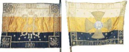
This banner belonged to the Tsarevich's regiment. Therefore, there is no doubt that during his supposed future reign it was planned to use exactly this arrangement of colors on the imperial banner...
In addition, for the 300th anniversary of the House of Romanov, Tsar Nicholas II approved an anniversary medal using the colors: White-Yellow-Black.
Brothers and sisters, we urge all of you not to be divided among each other based on differences in the arrangement of colors on the imperial flag. And this issue, important for all of us, will undoubtedly be resolved one of the first with the accession to the throne of the coming and promised to the Russian people of God’s Anointed - the Tsar.
Strengthen and help us, Lord! Amen.
Black Hundreds
For a long time, these names were given an extremely negative character, but the phrase “Black Hundred” has been found in Russian chronicles since the 12th century. In medieval Rus', “black people” were called “people of the earth” - “zemskiy” (citizens and villagers), in contrast to “servicemen”, whose life was inextricably linked with the institutions of the state. Thus “h. With." is an association of zemstvo people, and calling their organizations “ch. With." - ideologists of the early 20th century. thereby sought to emphasize that in a difficult time for the country, the unification of “zemstvo people” - “ch. With." - are called upon to save and protect its main foundations...
History of the name
The very name “Black Hundred” can be traced, for example, in the classic course of lectures by V. O. Klyuchevsky “Terminology of Russian History.” The phrase “Black Hundred” entered Russian chronicles starting from the 12th century (!) and played a primary role until the era of Peter the Great. “Black Hundreds” are associations of “zemstvo” people, people of the earth, in contrast to “servicemen”, whose life was inextricably linked with the institutions of the state. And by calling their organizations “Black Hundreds,” the ideologists of the early 20th century thereby sought to revive the ancient purely “democratic” order of things: in a difficult time for the country, the unification of “Zemstvo people” - the “Black Hundreds” - are called upon to save its main foundations.
The founder of the organized “Black Hundreds” V. A. Gringmut in his already mentioned “Manual of the Monarchist Black Hundreds” (1906) wrote: “The enemies of the autocracy called the “Black Hundred” the simple, black Russian people who, during the armed rebellion of 1905, stood up for their defense autocratic Tsar. Is this name honorable, “Black Hundred”? Yes, very honorable. The Nizhny Novgorod Black Hundred, gathered around Minin, saved Moscow and all of Russia from the Poles and Russian traitors.”
© Dmitry Litvin, text, 2016
© Book stall, publication, 2016
1. Benin
This flag is considered a symbol of the Benin Empire, which existed in the lower reaches of the Niger River, on the territory of modern Nigeria, in the 15th-19th centuries. In the 18th century The Benin Empire was shaken by many years of internecine war, which apparently they tried to eloquently depict on the flag. In fact, it is not known exactly who created such a strange flag. The flag was recovered in battle by Admiral Kennedy's expedition against Benin in 1897. Now this flag is in the National Maritime Museum, which is located near London.
2. Frieslan (Netherlands)
The flag of the Dutch province of Friesland does not depict clumsily drawn hearts, as it might seem at first glance, but red leaves of a water lily.
3. Guam
The flag of Guam, an island in the western Pacific Ocean that is part of the United States, is a blue flag with a red border on all sides. In the center of the flag is an image of the coat of arms of Guam. The coat of arms depicts a proa boat in the bay of the city of Hagatna, the capital of Guam, a shore with a coconut tree, a river and the inscription in red letters “GUAM”. In the distance is the local rock “Puntan Dos Amantes”. The shape of the coat of arms resembles that of basalt/coral stone, which was used by local residents in hunting and war.
The flag was designed by Helen L. Paul, the wife of a naval officer who served in Guam.
The Proa boat personifies the courage of the indigenous people of the island, with which its representatives surfed the waves of the ocean during sea voyages, covering vast distances.
The river flowing into the ocean symbolizes the willingness of the local people to share the earth's resources with others.
The beach demonstrates the Chamorro's devotion to their homeland and the environment.
The rock represents the island's people's commitment to passing on their heritage, culture and language to future generations.
The coconut tree, growing on the infertile sand, symbolizes the resilience and determination of the people of Guam, and its curved trunk represents the trials they endured.
The blue color symbolizes the unity of Guam with the sea and sky.
The red border of the flag symbolizes the blood shed during the Japanese occupation of the island during World War II and the Spanish occupation.
In the pre-colonial period, the island did not have its own flag. It was not developed during the period of Spanish rule. The first flag was officially adopted only on July 4, 1917 during the American period (the only difference in that flag was the absence of a red border). Modern version was adopted on February 9, 1948.
4. Swaziland
The Kingdom of Swaziland is a state in the southeastern part African continent, borders South Africa and Mozambique. The national flag of Swaziland was adopted on October 30, 1967. It is a panel with five horizontal stripes; in order from top, blue, yellow, red, yellow and blue. The central red stripe depicts two spears and a staff, with an African shield on top of them. The staff and shield are decorated with injobo - decorative tassels; The bird feathers depicted on the injobo flag represent the king.
Each of the colors of the flag has a specific meaning. Red symbolizes past battles and struggles, blue - peace and stability, yellow - Natural resources countries. The black and white coloring of the shield symbolizes the peaceful coexistence of the black and white races.
5. Isle of Man
The Isle of Man is located in the Irish Sea at approximately the same distance from England, Ireland, Scotland and Wales, and belongs to the British Crown. The symbol of the Isle of Man is a triskelion, three running legs emerging from a single point. The triskelion symbolizes stability, as reflected in the island’s motto: “No matter how you throw it, it will stand” (Latin: Quocunque Jeceris Stabit). He is also depicted on the flag and coat of arms of the island.
6. Mozambique
The flag of the Republic of Mozambique, a state in southeast Africa, was adopted on May 1, 1983. The flag of Mozambique is the only flag in the world that has an image modern weapons- Kalashnikov assault rifle.
The national flag has five colors: red, green, black, golden yellow and white.
The colors represent:
red - resistance to colonialism, armed struggle for independence and defense of sovereignty;
green - the country's plant wealth;
black - African continent;
golden yellow - the country's mineral wealth;
white - the justice of the Mozambican people’s struggle for peace.
From the shaft there are horizontal green, black and golden-yellow transverse belts. In the center of the red triangle is a star, in which a weapon and a hoe placed crosswise are placed on an open book.
The star symbolizes hope for international solidarity with the Mozambican people.
The book, hoe and weapon symbolize education, production and defense.
In 2005, a competition was announced for a new flag, coat of arms and anthem of the country. 119 proposals were submitted to the competition, from which the best project, however, to this day the flag remains the same. According to press reports, Mozambique's parliamentary opposition is insisting that the image of a Kalashnikov assault rifle, which symbolizes the country's struggle for independence, be removed from the flag. This proposal drew criticism from the public.
The film "Baron of Arms" talked about this flag, as well as in detail about the war in Mozambique.
7. Kyrgyzstan
The national flag of the Kyrgyz Republic, according to its official description, is a red panel, in the center of which there is a round solar disk with forty evenly diverging rays of golden color. Inside the solar disk, the tundyuk of a Kyrgyz yurt is depicted in red. The width of the flag is three-fifths of its length. The diameter of the radiant disk is three-fifths the width of the flag. The ratio of the diameters of the solar and radiant disks is three to five. The diameter of the tundyuk is half the diameter of the radiant disk.
The red monochrome of the flag symbolizes valor and courage, the golden Sun, bathed in its rays, personifies peace and wealth, and the tunduk is a symbol of the father’s house in the broad sense of this expression and the world as the universe. 40 rays united in a circle mean the unification of 40 ancient tribes into a single Kyrgyzstan. Tyundyuk symbolizes the unity of the peoples living in the country. The red color of the flag was the color of the flag of the magnanimous Manas, the hero of the Kyrgyz epic of the same name - the hero who united the Kyrgyz.
8. Butane
The Kingdom of Bhutan is a state in Asia in the Himalayas, located between India and China. The capital is Thimphu. The name itself is Druk Yul or Druk Tsenden - “the land of the thunder dragon.” The national flag of Bhutan features a druk (white dragon) on a yellow and orange background. The flag is divided diagonally from the bottom of the staff, forming two triangles. The upper triangle is yellow, the lower triangle is orange. The dragon is located in the center and faces away from the shaft.
This flag, with minor changes, has been used since the 19th century. It acquired its current form in 1969 and was officially adopted in 1972.
The dragon depicted on the flag symbolizes the local Tibetan name of Bhutan - the Land of the Dragon. He holds in his claws gems, symbolizing wealth. The yellow field symbolizes the theocratic monarchy, and the orange field symbolizes the Buddhist religion.
9. Northern Mariana Islands
The Commonwealth of the Northern Mariana Islands is located in the western Pacific Ocean in the Mariana Islands archipelago, sharing them with Guam, and is part of the United States. Blue color the flag represents Pacific Ocean, which washes the islands, "giving them love and peace", the star symbolizes the Commonwealth. A stone column is a symbol of the culture of a nation. A wreath woven from four types of exotic flowers (ylang-ylang, seur, anja, teibwo) is a symbol of the native culture of the islands.
10. Virgin Islands
The US Virgin Islands are a group of islands in the Caribbean Sea that have the status of an unincorporated organized territory of the United States. The flag of the islands was adopted on May 17, 1921. Consists of a simplified image of the Great Seal of the United States between the letters V and I (representing the Virgin Islands). The eagle holds a laurel branch in one paw and three arrows in the other, representing the three main islands of St. Thomas, St. John and St. Croix. The colors of the flag symbolize different natural features Virgin Islands - yellow (flowers), green (hills), white (clouds) and blue (water). The flag was created by artist Percival Sparks at the request of the American governor of the islands, Eli Kitel.
11. Central African Republic
The national flag of the Central African Republic was adopted on December 1, 1958. Its design was developed by Barthelemy Boganda, a prominent figure in the independence movement of the Central African Republic, who nevertheless believed that “France and Africa must go together.” Therefore, he combined the red, white and blue colors of the French tricolor and the Pan-African colors: red, green and yellow. The red color symbolizes the blood of the people of the country, the blood that was shed in the struggle for independence, and the blood that the people will shed if necessary to defend the country. The color blue symbolizes the sky and freedom. White - peace and dignity. Green - hope and faith. The color yellow symbolizes tolerance. Golden five pointed star- a symbol of independence and a guide to future progress. The ratio of the width of the flag to its length is 3:5.
12. Lombardy (Italy)
Lombardy is the most populous and richest region in Italy and one of the richest regions in Europe. It extends from the Po Valley to the Italian Alps. The coat of arms and flag of the region depict the Camun rose, the most common subject of rock paintings in the Lombardy Val Camonica. Here is the largest group of petroglyphs in Europe, which has become a monument World Heritage UNESCO and, of course, a tourist mecca. There are many assumptions about the meaning of the Kamun rose. Italian archaeologist Emmanuel Anati believes that it could symbolize a complex religious concept and may have been a solar symbol. The stylized Camun rose has become a symbol of Lombardy and is depicted on the region's flag. This stylization was carried out by the graphic artist Pino Tovaglia in 1974.
13. Nepal
Federal Democratic Republic Nepal is a country in the Himalayas in South Asia. Borders with India and China. The capital is the city of Kathmandu. This country has the only this moment the non-rectangular flag of all known (meaning national flags). This banner was composed of a simplified combination of the pennants of the two branches of the Rana dynasty - the past rulers of the country. The flag was adopted on December 16, 1962, simultaneously with the formation of a new constitutional government. By that time, pennants had been used separately for two centuries. They began to be used together in the 20th century. Red is the color of rhododendron, the national plant of this country. In addition, red also symbolizes victory in the war. The blue outline is the color of the world. The two royal symbols represent the hope that Nepal will last as long as the sun and moon. Before 1962, the sun and moon were with human faces. But now faces have been removed from the symbolism to make the flag more modern.
14. Libya
On March 8, 1977, Libya seceded from the Federation of Arab Republics; official name state was changed to "Socialist People's Libyan Arab Jamahiriya". On November 11, 1977, the flag of Libya was changed to a single-color green (which was a reaction to Anwar Sadat's visit to Israel, which in Libya was considered a betrayal of Arab and Islamic values).
The green color of the flag symbolized Islam, the state religion of the country, as well as the Green Revolution of Muammar Gaddafi.
Participants in the uprising that broke out in Libya in February 2011 against Gaddafi began to use the former flag of the monarchy, which later became the official banner. Now the flag of the Libyan Republic is a red, black and green banner with a white crescent and star.
15. St. Petersburg, Florida (USA)
The flag was created by Ronald Whitney in 1983. Its creator describes the flag as follows: orange and red stripes symbolize the light of the sun, a green stripe represents the rich soil of the territory, and two blue stripes represent water, and in the center is a large white pelican, the symbol of the city.
16. Zambia
The flag was designed by Mrs Gabriel Ellison, who is also the author of the coat of arms of Zambia and the design of many postage stamps countries. The main colors of the national flag of Zambia are green, red, black, orange. The flag is a green panel, in the lower right corner of which there is a flag of three vertical stripes of red, black, orange, and in the upper right corner there is an image of a screaming eagle with open wings.
The colors have the following meaning:
Green color symbolizes natural resources.
The color red symbolizes the blood shed for Zambia's independence.
The color black represents the people of Zambia.
Orange color symbolizes the wealth of the country mineral resources(primarily copper).
The screaming eagle represents the rise of the Zambian people above the problems of the state.
17. Durban (South Africa)
Durban is the largest port city in South Africa. The largest mosque is located here southern hemisphere Juma in the Indian Quarter (975 sq. m), the first and largest Hindu temple in Africa, Sri Ambalavaanar Alayam and St. Paul's Church (1853). The religious symbol for the flag was probably not chosen by chance; as you can see, three major religions of the world coexist here.
18. Sri Lanka
Sri Lanka is a country in South Asia, on the island of the same name off the southeastern coast of Hindustan. From the time of the Portuguese invasion until independence, the country was called Ceylon in European languages. The flag of Sri Lanka features a golden lion holding a sword in its right front paw on a crimson background with four golden leaves at the corners. Along the edge of the flag there is a yellow border, framing, among other things, two stripes of green and orange color. The lion represents the ancestor of the Ceylonese, the green and orange stripes symbolize the Muslim and Hindu minorities respectively, and the red field represents the Buddhist majority. In 1972, when the country was renamed Sri Lanka, four leaves of the sacred Buddhist paipul (fig) tree were added to the corners of the red field. The leaves symbolize love, compassion, understanding and self-control. This version of the flag became official in 1978.
19. Switzerland
The flag of Switzerland is square; other than that, only the flag of the Vatican has this shape. It consists of a red square with a bold white cross in the center. Its official proportions are 1:1, but more rectangular ones are often used - 2:3 and 7:10. According to one version, the flag comes from the coat of arms of the canton of Schwyz (one of the three cantons that formed the Swiss Confederation in 1291, along with Uri and Unterwalden). The first time a banner of this type was used was at the Battle of Laupen in 1339. Then the crosspieces of the cross were narrower and reached the edges of the flag, reminiscent of the modern Danish flag. The flag is officially approved as state symbol Switzerland in 1889. Red Cross symbol used International Committee Red Cross, comes from the Swiss flag.
20. Brussels (Belgium)
The flag of the capital Brussels features a yellow iris (Iris pseudacorus) on a blue background. The flower was chosen as a symbol of the city because... it grew up in numerous swamps - the city itself was founded on swampy soil. Historical name Brussels (Broeksel) goes back to 2 Old Dutch words: broec - “swamp” and sele - “settlement”, i.e. - "settlement in a swamp." According to legend, the Duke of Brabant's troops, knowing that the plant could only grow in shallow water, were able to gallop across the flooded plains. His opponents, however, not knowing about this feature of the irises, also tried to cross the plain, but got stuck in the swamps. Currently, the Belgian capital hosts the Iris Festival (Fête de l'Iris) every year.
21. Saint Pierre and Miquelon
Saint-Pierre and Miquelon is the only territory left to France from the former colony New France. It is located on small islands in the Atlantic Ocean, 20 km south of the Canadian island of Newfoundland. The official flag of Saint-Pierre and Miquelon, as an overseas territory of France, is the French tricolor. The unofficial flag depicts the ship "Grande Hermine" on which Jacques Cartier approached the island of Saint-Pierre on June 15, 1536. The three flags placed at the flagpole symbolically show the origins of the majority of the inhabitants of the islands (from top to bottom): Basques (flag of the Basque Country), Bretons (flag of Brittany) and Normans.
22. Pernambuco (Brazil)
Pernambuco is a state in eastern Brazil, with the administrative center being the city of Recife. The state's coastline, stretching for 185 km, is washed by the Atlantic Ocean, from which the state's territory extends inland in a thin strip. The name comes from Paranambuku, which translates as " long river" The flag of the state of Pernambuco was officially established on February 23, 1917. The star represents the state itself, the three arches of the rainbow symbolize peace and union, and the luminary means that the inhabitants of Pernambuco are children of the Sun. The cross refers to the name Santa Cruz (Holy Cross), which was given to Brazil by European explorers.
23. Nunavut (Canada)
Nunavut is the largest and least populated of Canada's provinces and territories. With a population of 29,474 people, its area is comparable to the entire Western Europe. Nunavut was formed on April 1, 1999, as a result of separation from the Northwest Territories. On the same day, the provincial flag was approved. The flag’s panel is vertically divided into two equal parts (yellow (at the hoist) and white) by an image of a stone monument “inuksuk”, painted red, placed in the middle of the flag. In the upper right corner of the flag is sewn the blue five-pointed star Nikirtsuituk (Polar). The colors blue and yellow speak of the richness of Nunavut's land, sea and sky. The red symbolizes his connection to Canada.
24. Wallonia (Belgium)
The Walloon region of Belgium unites the five southern provinces of Belgium. The Brave Rooster (French coq hardi) or Walloon Rooster (Walloon cok walon) is a traditional Gallic symbol and recalls linguistic and cultural ties with France. The flag is an image of a red rooster with its right leg raised and its beak closed on a yellow background. The rooster looks at the edge of the pole. The colors are identical to the flag of the city of Liege. The flag was created in 1913 by artist Pierre Paulus. On July 3, 1991, the French Community adopted the Walloon flag as their official symbol. On July 15, 1998, the region adopted the flag as the official symbol of Wallonia.
25. Chelyabinsk region (Russia)
Flag Chelyabinsk region is the official symbol of the Chelyabinsk region as a subject of the Russian Federation. The flag was approved on December 27, 2001 and entered into the State Heraldic Register of the Russian Federation under number 898. The main figure of the flag is a loaded white camel with yellow luggage - a hardy and noble animal that inspires respect and personifies wisdom, longevity, memory, fidelity, patience, power over by the elements. The red color of the flag field - the color of life, mercy and love - symbolizes courage, strength, fire, feelings, beauty, health. The red color of the field is simultaneously consonant with the work of metallurgists, machine builders, foundry workers, power engineers, the main technological processes which are associated with thermal reactions, which complements the content of the coat of arms of the Chelyabinsk region, as an industrialized region. The yellow stripe symbolizes Ural Mountains, connecting Europe and Asia, their beauty, grandeur, and richness of mineral resources. White color is a symbol of nobility, purity, justice, generosity.
This is our only state banner, under which Russia has not suffered ANY defeat, a banner that has not stained itself in any way and has passed through the centuries with honor.
In the middle of the 19th century. a stamp reform was carried out, which included the creation of a state banner. The streamlining of imperial heraldic paraphernalia was largely caused by the desire to strengthen the foundations of monarchical power in Russia. No matter how liberal and humanist Emperor Alexander II was, he was a monarch, the son of his father, Nicholas I. The latter repeatedly expressed his dissatisfaction with the insufficient prevalence of imperial symbols; It was under him that the Russian patriotic anthem “God Save the Tsar” appeared.
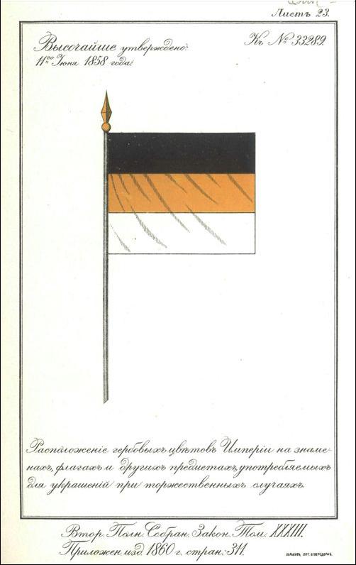
On June 11, 1858, Alexander II approved the imperial state flag of black, yellow and white colors. This happened during the years of the bright revival of Russia after the difficult Crimean War, during the years of the high rise of the Russian folk spirit. The decree commanded that all “banners, flags... used for decoration on special occasions should be from the Armorial Flowers of the Russian Empire.”
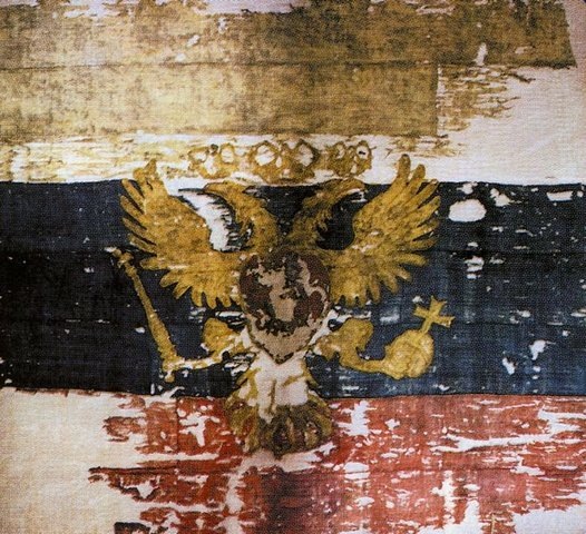
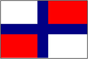
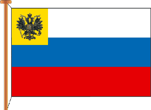
Photograph of the flag of the Tsar of Moscow, the oldest surviving one Russian flags (1693)
The following was a description of the national flag: “...The arrangement of these colors is horizontal, the top stripe is black, the middle stripe is yellow (gold), and the bottom stripe is white (silver). The first two stripes correspond to the black State eagle on a golden field... The lower stripe corresponds to... the white (silver) horseman - St. George in the Moscow coat of arms.” Black color - the color of the Russian double-headed eagle - is a symbol of sovereignty, state stability and strength, the inviolability of historical borders, the meaning of the very existence of the Russian nation. Golden (yellow) color was once the color of the banner of Byzantium, adopted as the state banner of Russia by Ivan III, a symbol of spirituality, aspiration for moral improvement and fortitude. White color is the color of eternity and purity, which has no differences among all peoples. For Russians, this is the color of St. George the Victorious - a symbol of selfless sacrifice for the Fatherland, for the Russian land, which has always puzzled, delighted and frightened foreigners.
After the tsar’s decree, the black-yellow-white flag was called the “Armoral National Flag,” just as shortly before that the anthem “God Save the Tsar” received the status of a Russian People's Song. The patriotic press reported that “The flag is built according to the state emblem,” that the People, through constant contemplation of this flag, become familiar with the “Armoral symbolic colors of the Russian Empire.”
The black-yellow-white flag was perceived by society as imperial, governmental, in contrast to the white-blue-red flag of the Russian merchant fleet. The imperial flag was associated in the minds of the people with ideas about the greatness and power of the state. This is understandable, what could be majestic in the trade flag, in its very colors, which were artificially tied to Russian culture by Peter I?
Of course, one cannot deny all the merits of the Great Emperor, but here he clearly went too far (he simply copied the colors of the flag of Holland, which he worshiped).
Coexistence of the two flags until the 70s. XIX century was not so noticeable, but the question of the “duality” of the most important state Russian symbol is gradually beginning to arise. This duality is perceived differently by the Russian public. Ardent defenders of the Russian autocracy believed that there could be no talk of any flag other than the imperial one, legalized by the emperor: the people and the government must be united. The opposition to the tsarist regime stood under the trade flags of white, blue and red, which became a symbol of the anti-government political movements of those years. It was these colors that were defended by the so-called. “liberal” circles who shouted to the whole world that they were fighting the despotism and reactionary nature of the tsarist government, but, in fact, were fighting against the greatness and prosperity of their own country (by the way, the same “liberals” a century later destroyed another empire - the Soviet Union) .
During this heated controversy, Alexander II died at the hands of the revolutionaries. His son and successor, Alexander III, not fully understanding the situation, committed a sharp and rash act - on April 28, 1883, he gave the white-blue-red flag the status of a state flag, but without CANCELING the imperial one. Russia now has two official state flags, which further complicates the situation.
On April 29, 1896, Emperor Nicholas II ordered that ONLY white-blue-red be considered the National and State flag. Most likely, the tsar was “influenced” (I wonder who?), convincing him that the black-yellow-white flag “has no heraldic historical basis in Russia” to be considered a cloth bearing Russian national colors. This begs the question, what kind of historical basis does the trade flag have? In any case, they are no closer to the Russian spirit than colors Great Empire. It was from this moment that the decline began in the country, the chain tragic events: Khodynka, defeat in the ridiculous war with Japan, the Revolutions of 1905 and 1917, ...must we continue?
In the early 1910s. was approaching significant event- The 300th anniversary of the House of Romanov, and in government circles there has been a new turn in relation to the State Flowers. Supporters of monarchical foundations strongly advocated the return of the historical black, yellow and white colors. The imperial flag was again seen as protecting the foundations of Russian life from impending changes. As a result, in May 1910, a Special Meeting was formed to clarify the issue “about the state Russian national colors.” It worked for almost 5 years, and the majority of participants voted for the return of the imperial flag, but “upside down,” i.e. white-yellow-black. The minority insisted on a white-blue-red flag. As a result, a “symbiosis” of two competing flags appeared: the white-blue-red flag had a yellow square with a black double-headed eagle in the upper corner.
There is a lot of debate about the correct arrangement of colors on the flag of the Russian Empire. Imperial flag, as we are accustomed to seeing today, consists of an upper black stripe, a middle yellow stripe and a lower white stripe. In this form it was adopted in 1858.
How to correctly: black-yellow-white or white-yellow-black? There are a lot of publications on this topic, mostly of an educational nature, where there is no justified explanation of how colors should be positioned correctly. There is only a reference to the highest approved decree No. 33289 of June 11, 1858 “ On the arrangement of the coat of arms of the Empire on banners, flags and other objects used for decoration on special occasions" But the circumstances under which the decree was adopted, the current state situation and who was the author of this document are not indicated.
So until 1858 the flag was different. The order of the colors in it was as follows: starting from the top stripe - white, then yellow and black at the bottom. It existed in this form until its official adoption. Along with it there was white-blue-red... But white-yellow-black before Alexandra II, and after that the black-yellow-white flag was perceived by society as imperial, governmental, in contrast to the white-blue-red flag of the Russian merchant fleet. The imperial flag was associated in the minds of the people with ideas about the greatness and power of the state. It’s clear what could be majestic in a trade flag, in its very colors, which were artificially tied to Russian culture Peter I(which simply copied the colors of the Dutch flag).
Coexistence of the two flags until the 70s. XIX century was not so noticeable, but the question of the “duality” of the most important state Russian symbol is gradually beginning to arise. This duality is perceived differently by the Russian public. Ardent defenders of the Russian autocracy believed that there could be no talk of any flag other than the imperial one, legalized by the emperor: the people and the government must be united. The opposition to the tsarist regime stood under the trade flags of white, blue and red, which became a symbol of the anti-government political movements of those years. It was the “trade flag” that was defended by the so-called. “liberal” circles who shouted to the whole world that they were fighting the despotism and reactionary nature of the tsarist government, but, in fact, they were fighting against the greatness and prosperity of their own country.
During this heated controversy, Alexander II died at the hands of the revolutionaries. His son and successor, Alexander III On April 28, 1883, he gave the white-blue-red flag the status of a state flag, but at the same time without canceling and imperial. Russia now has two official state flags, which further complicates the situation. And already from April 29, 1896, the emperor Nicholas II ordered that the national and state flag be considered white-blue-red, also indicating that “ other flags should not be allowed».
 Black-yellow-white remained only with the imperial family. The emperor was “persuaded” because allegedly all Slavic peoples were assigned such colors - and this emphasizes their “unity”. And explaining this by the fact that the black-yellow-white flag “does not have heraldic historical foundations in Russia” to be considered a cloth bearing Russian national colors. This begs the question, what kind of historical basis does the trade flag have?
But let's return to the white-yellow-black banner. That is, then, before adoption, the white-yellow-black flag was simply turned over.
Can be traced back to the “coup” and the author - Bernhard Karl Köhne(he will be discussed at the end of the article in order to fully understand what kind of person got involved in “correcting” Russian heraldry). Upon his accession to the throne, Alexander II decided, among other things, to put the state symbols in order - and to bring them into line with pan-European heraldic standards.
This was to be done by Baron Bernhard-Karl Köhne, who was appointed head of the stamp department in 1857. Koehne was born into the family of a secret state archivist, a heretic who adopted the Reformed religion. He came to Russia under the patronage. In heraldic historiography he earned a sharp negative assessment, despite his vigorous activity.
But be that as it may, the flag was accepted and in this form it existed until 1910, when monarchists raised the question of the “correctness” of the flag, since the 300th anniversary of the House was approaching Romanovs.
A special meeting was formed to clarify the issue “about the state Russian national colors.” It worked for 5 years, and the majority of participants voted for the return of the imperial white-yellow-black flag with the “correct” arrangement of colors as the main, state flag.
 For some reason and why, it is not clear, but they made a compromise - the result was a symbiosis of two competing flags: the eclectic white-blue-red flag had a yellow square with a black double-headed eagle in the upper corner. We fought a little with this one in the First World War. Further, the history of the imperial flag ends for a well-known reason.
IN in heraldry, an inverted flag means mourning, Köhne knew this very well, heading the heraldic department of the Empire. The death of the Russian emperors confirmed this. In maritime practice, an inverted flag means that the ship is in distress. It is clear that colors are still confused and flags are hung upside down, consciously and unconsciously, but for this to happen at the state level and with many years of struggle, special efforts of special people are needed.
The existence of the white-yellow-black flag is confirmed by newsreels, but they are treated differently due to the black and white film. Supporters of the black-yellow-white flag explain that on the set of the white-blue-red flag, without being embarrassed by the simple experience of comparing colors, when converting colored flags into black and white mode using any well-known graphic editor.
Also, the tricolor in the white-yellow-black arrangement can be seen in artists’ paintings.
Vasnetsov V. M. “News of the capture of Kars” 1878
In the picture Vasnetsova dedicated to the Russian-Turkish war, a white-yellow-black flag is installed. Interesting fact: the painting dates back to 1878, that is, it was painted 20 years after the release of statement No. 33289 “ about the arrangement of coat of arms colors” in which they were changed the other way around. It turns out that the people still used uninverted white-yellow-black flags.
(In the center, either the (blue-yellow-red) flag of the United Principality of Wallachia and Moldavia, an ally of the Russian Empire in Russian-Turkish War(1877-1878), or the Pan-Slavic (blue-white-red) flag - the difficulty of determining from reproduction the color of the middle zone. In 1848, at the Pan-Slavic Congress in Prague, the Slavic peoples adopted a common Pan-Slavic flag, repeating the colors of the Russian (white-blue-red) flag).
And here is the picture Rozanova"Fair on Arbat Square." White, yellow and black flags can be seen waving on the roofs of buildings. And along with them are white, blue and red. The picture was painted just during the coexistence of the two flags.
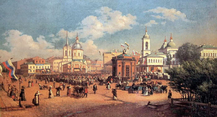
Rozanov , “Fair on Arbat Square”
No matter how they explain the location of the black stripe at the top: this is the incomprehensibility of God (how is God light?), and the greatness of the Empire, and the color of Spirituality (referring to the monastic robe). Also interpreted as: black - monasticism, yellow - gold of icons, white - purity of the soul. But all this is from the category of popular interpretations “whoever comes up with it.”
At the same time, the most important point is missed, that the colors of the imperial flag should be identical to the words that express our entire Slavic essence: Orthodoxy, Autocracy, Nationality. Or to put it another way: Church, King, Kingdom. What color goes with each of these words? The answer is obvious.
In 1858, along with the flag, changes were made to the state emblem. Koehne created it the way we are used to seeing it. Although under Nicholas I it was different.

Coat of arms of Köhne, 1858
For example, the Coat of Arms depicted on coins.
Here are the Nikolaev coins, 1858
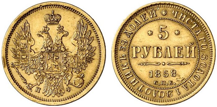
And here is a coin from 1859 of Alexander II ( The reign of Alexander II, whose years were nicknamed the “era of great reforms,” for Russian Jews, as well as for the country as a whole, was a sharp contrast to the previous period: reforms in the economy, relative political freedoms, rapid development of industry - all this, as in the century previously in Prussia, created the conditions for Jewish assimilation, which never happened). Here you can clearly see how accurately the eagle was “licked” from the Habsburg coat of arms. A particularly striking detail is the eagle's tail. And all this in one year with the change of the flag. Magendovids (six-pointed stars) also appeared on coins. Since the Masons are great symbolists, they just wanted to add at least a drop of tar to our heraldry.
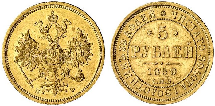
A few more coins for comparison:
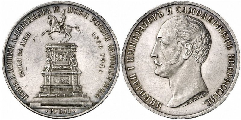
Back in 1959, a commemorative coin and medal “Monument of Emperor Nicholas I on Horseback” was issued. Magendavids are now so small that they can only be seen under a magnifying glass
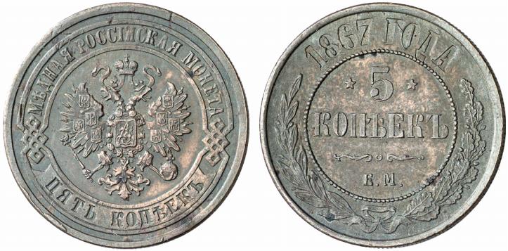
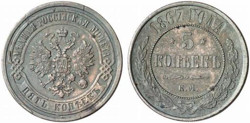
The copper coins were updated, the design changed radically, the stars there are “Soviet” - pentacles.
The image below shows the similarity of the coat of arms that Koehne “composed” with the coat of arms of the Habsburgs.
![]()
Habsburg coat of arms
For comparison:
1) The crown acquired a ribbon (more like a snake); before this, this ribbon had never been used in Russian heraldry;
2) Previously, the wings on all eagles had a lot of feathers, but now they began to absolutely copy the Habsburgs, even in design, between the large feathers and here and there, there are small feathers. At the same time, our eagle turned out to have 6 feathers, versus 7;
3) The combination of the coat of arms and the chain, although this arrangement had been used previously, on all previous coins the order was clearly visible Holy Apostle Andrew the First-Called, now it’s just a chain, like the Habsburgs themselves;
4) Tail. Everything is clear without comment.
Bernhard Karl (in Russia "Boris Vasilyevich") Köhne (4/16.7.1817, Berlin - 5.2.1886, Würzburg, Bavaria) was born into the family of a secret state archivist who adopted the Reformed religion (Köhne himself and his son remained Protestants, despite the fact that that connected their lives with Russia, his grandson was already Orthodox).
 He became interested in numismatics early and published his first work in this field (“Coinage of the City of Berlin”) at the age of 20, when he was still a student at a Berlin gymnasium. He was one of the active figures, and then the secretary of the Berlin Numismatic Society. In 1841–1846 supervised the publication of a journal on numismatics, sphragistics and heraldry.
Köhne met Russia in absentia back in the early 1840s. Famous numismatist Yakov Yakovlevich Reichel, who served in the Expedition for the Procurement of State Papers, the owner of one of the largest numismatic collections, drew attention to the young man, who soon became his assistant in collecting and “representative” in German numismatic circles. After completing his university course, Koehne came to St. Petersburg for the first time.
He returned to Berlin with a firm desire to enter the Russian service and applied for the then vacant chair of archeology at the St. Petersburg Academy of Sciences (which never happened). As a result of Reichel’s patronage, on March 27, 1845, Koehne was appointed assistant to the head of the First Department of the Imperial Hermitage (the First Department included collections of antiques and coins, it was headed by a major numismatist Florian Antonovich Gilles) with the rank of collegiate assessor. By the end of his life, Koehne had risen to the rank of Privy Councilor (1876).
In St. Petersburg, Koehne developed a vigorous activity. The persistent desire to get into the Academy of Sciences, moreover, in the archaeological “direction”, stimulated not only his active study of archeology, but also his no less active organizational work. In an effort to gain the necessary weight in scientific circles, Koehne initiated the creation of a special numismatic society in Russia, but since archeology inevitably attracted him, he combined these two sciences under one “administrative” name - this is how the Archaeological-Numismatic Society appeared in St. Petersburg (later the Russian Archaeological Society ).
Köhne sought to promote himself and society on a European scale. It contained all the correspondence with foreign scientists. And foreign scientific societies invariably accepted him as their members, so that by the end of his life he was a member of 30 foreign societies and academies (he never got into the St. Petersburg one). By the way, orientation towards the West led to the fact that Koehne tried not to allow reports in Russian at meetings (only in French and German), and only after the ethnographer and archaeologist joined the society Ivan Petrovich Sakharov(1807–1863), the Russian language was restored to its rights.
The second half of the 1850s was Koehne’s “triumph” in Heraldry, when in 1856 he created the Great State Emblem of the Empire, and in June 1857 he became the manager of the Armorial Department at the department (with retention in office for the Hermitage). Having headed all practical work in the field of Russian heraldry, Koehne over the next years began a large-scale heraldic reform, trying to unify and give consistency to the body of Russian family and territorial coats of arms by bringing them into line with the rules of European heraldry (for example, turning the figures to the right heraldic side; replacing some that Koehne thought were not suitable for heraldry, figures for others, etc.) and the introduction of new principles and elements (placement of the provincial coat of arms in the free part of the city coat of arms, a system of emblems of the external part of territorial and city coats of arms, reflecting their status, etc. ).
Köhne’s career in the Russian Archaeological Society ended with the arrival of the new august leader of the Grand Duke Konstantin Nikolaevich. He did not approve the election of Koehne as secretary of the third department of the society (the only case in the entire history of the society), as a result of which at the beginning of 1853 Koehne left its ranks. Konstantin Nikolaevich had a persistent dislike for Koena. In particular, he disapproved of the draft state emblem of 1856–1857.
On October 15, 1862, Köhne was allowed to accept the baronial title, granted on May 12/24 of the same year by the ruler (due to the prince’s infancy Henry XXII) Principality of Reuss-Greiz Carolina-Amalia. In the literature one can find a statement that Koehne owes this title to the state emblem of the Russian Empire he created, but this data needs confirmation. Most likely, the enterprising numismatist simply bought the rights to this title and thus became, probably, the only Baron “Reuss-Greizsky” in Russia.
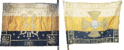
At the same time, we can firmly state that Nicholas II and the Tsarevich Alexei understood the problem of the state flag of the Russian Empire and intended to bring its colors to their original form, i.e. white-yellow-black. This is confirmed by the fact that the banner of the Livadia-Yalta amusement company named after Tsarevich Alexei consisted of white, yellow and black stripes.
In addition, for the 300th anniversary of the House of Romanov, Tsar Nicholas II approved an anniversary medal using the colors: White-Yellow-Black.
http://martinis09.livejournal.com/350800.html


